Sanook: UX Redesign for a Global Gift Shop
7-week solo redesign for an ethical e-commerce brand
ROLE
End-to-end UX designer
Project Type
Small Business Redesign
YEAR
7 weeks; 2025


I led a 7-week solo redesign of an ethical gift shop to make it easier and more inviting for new users.
Quick Summary
My Role
Solo UX Designer (research, usability testing, copy, design)
What We Learned
Vague labels, dark visuals, and a missing brand story made users feel lost and unsure.
What We Made
A cleaner, story-driven site with simplified navigation, clearer filters, and refreshed copy.
What Changed
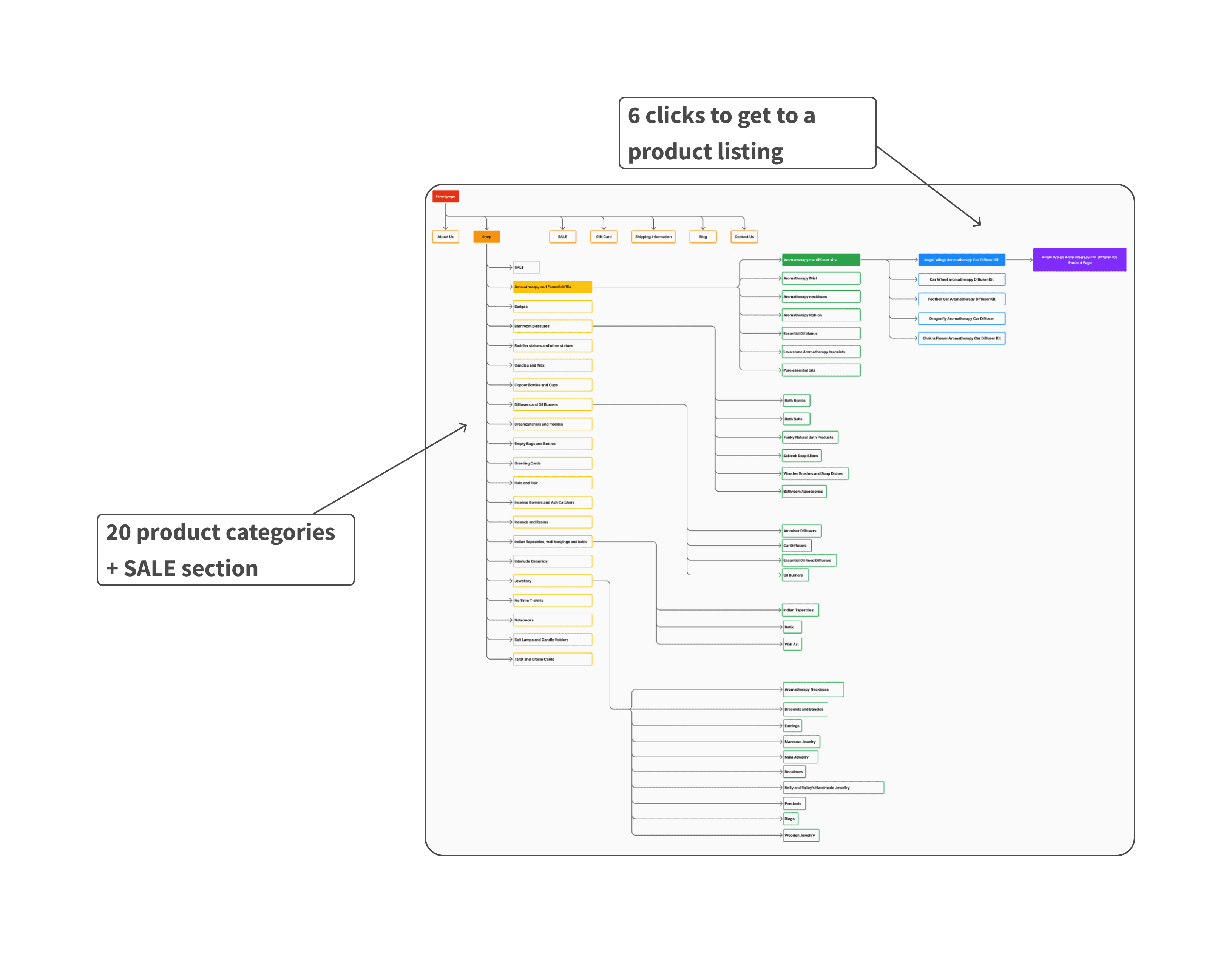
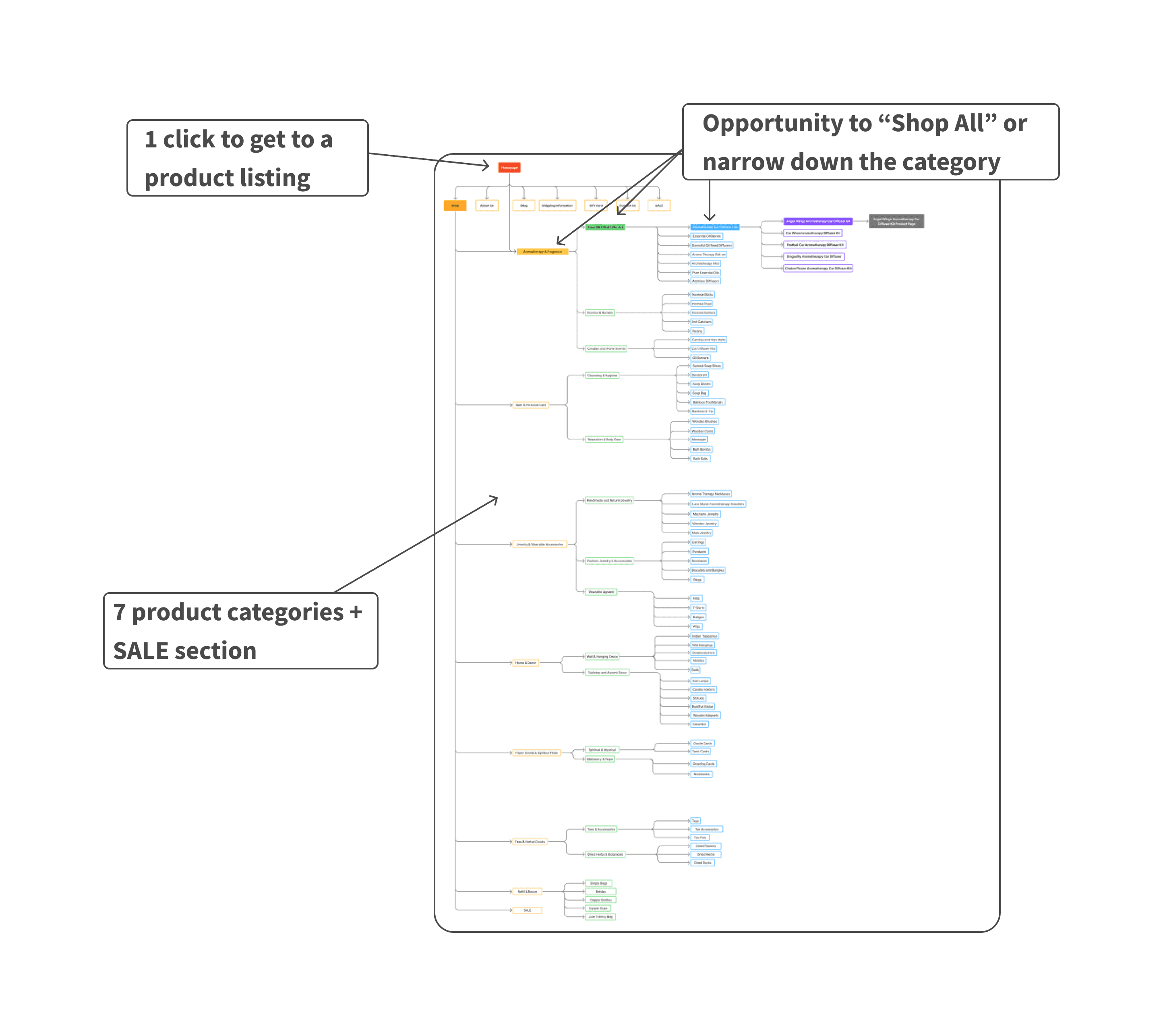
Navigation clicks: 7 → 2
CTA engagement: 18s → 5s
Product clicks: 3.5 → 1.8
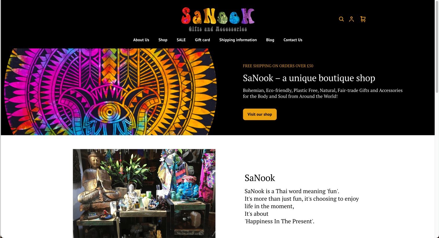
Mission and founder story now front and center
Project Overview
What it is: A 7-week solo UX redesign of Sanook, a values-driven gift shop focused on globally sourced, handmade goods. The goal was to improve clarity, trust, and product discovery for users.
The Problem
Sanook’s heartfelt mission and beautiful products were hidden behind vague categories and clunky navigation. The visual style didn’t match its warm, handmade identity, and new users often felt disoriented or unclear on what the brand stood for.
My Role
Solo UX designer responsible for:
User research
Usability testing
UX copy
Interaction design
Hi-fi prototyping
The Team
Worked directly with the founder for vision alignment and feedback. All research, strategy, and design were independently led and executed.
Project Type
Self-initiated redesign with real client collaboration and constraints.
Tools & Methods
Tools: Figma, Canva, Zoom, Notion
Methods: User interviews, usability testing, content strategy, UI redesign
Why it Mattered to Me
As someone who values clear storytelling, ethical business, and joyful design, this project was a chance to bring all three together. I learned how to turn cluttered experiences into intuitive ones, even without backend changes, and saw how good UX builds user confidence and connection.
Research & Discovery
How we built empathy and gathered insight
Participants: 5 online shoppers (ages 25–64) unfamiliar with Sanook
Methods:
Competitive Analysis
Moderated usability tests using the live site
Think-aloud protocol to capture first impressions and navigation habits
Goals:
Understand how new users browse and shop
Identify points of confusion, drop-off, or distrust
Learn what helps (or hurts) first-time engagement with the brand
Key Insights:
0% used filters (labels were unclear or buried)
100% added items to cart, but most struggled to navigate smoothly
60% scrolled the homepage first, seeking clarity
All users called out the left-hand nav bar as distracting
Visual style clashed with expectations for a warm, handmade brand
Competitive Analysis Findings
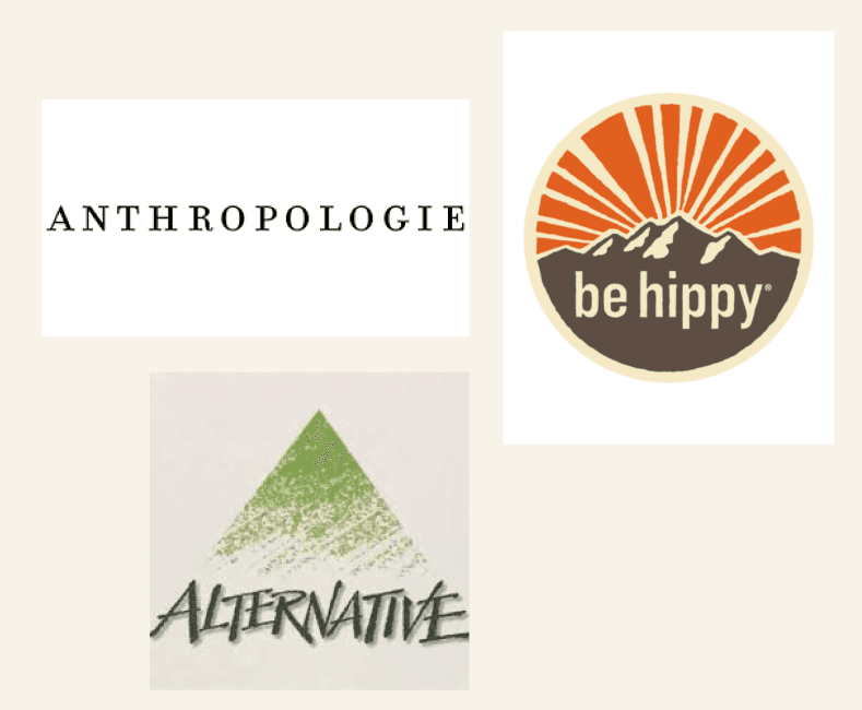
Used to:
- Identify market trends
- Highlight opportunities for differentiation
- Further inform my design decisions
Usability Test Findings
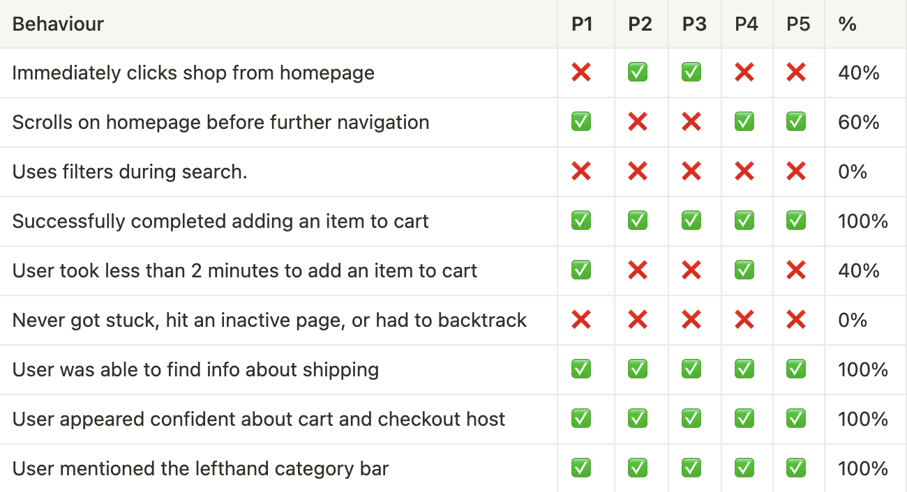
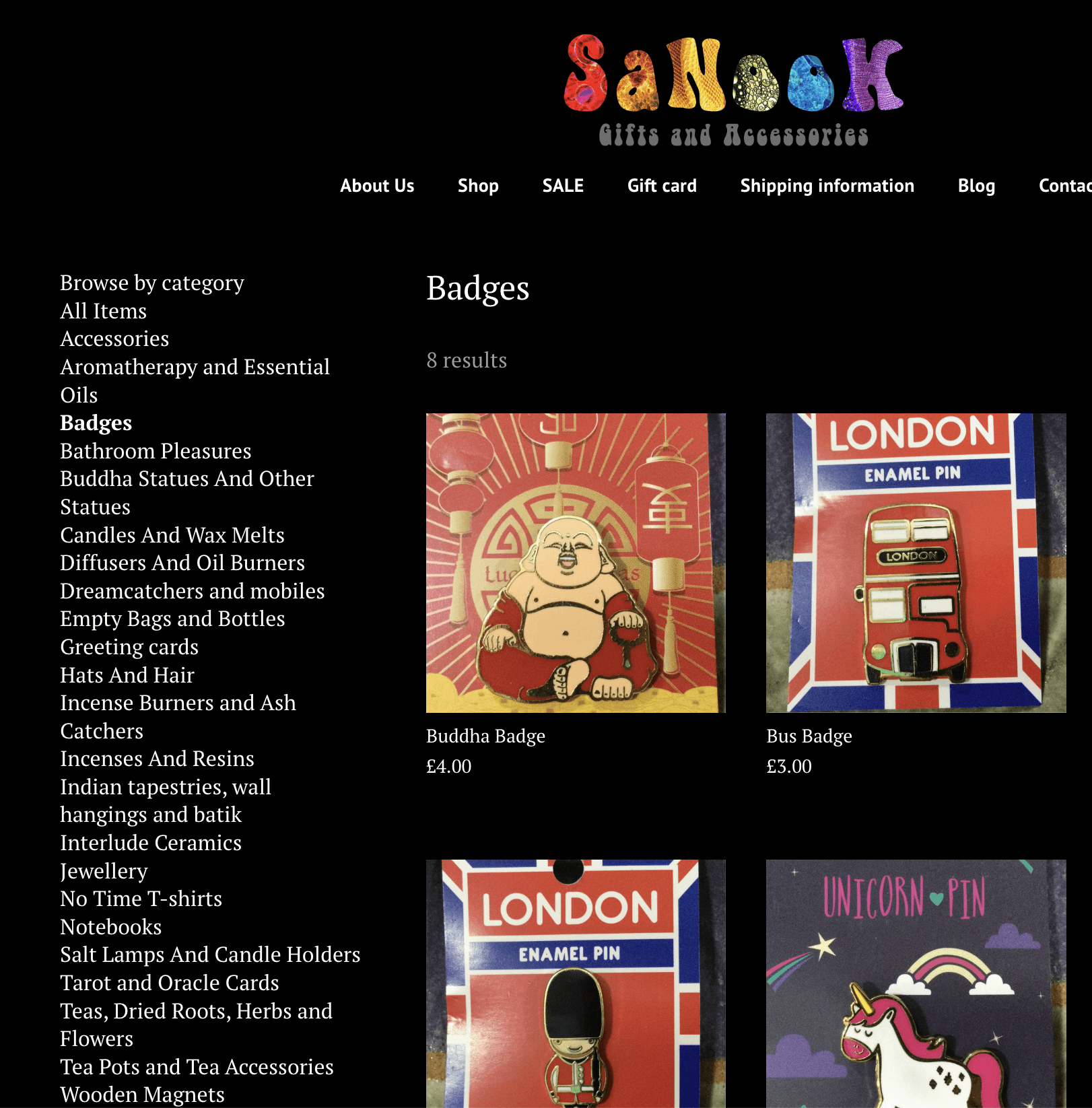
White Text on Black background is difficult for readers
Left-Hand Nav bar has too many categories
Define
Core Insight
Research showed that unclear structure, vague labels, and mismatched visuals left users confused about what Sanook offered or why they should trust it.
Main Problem
Sanook’s products and mission were hidden behind unclear structure and design. New users felt lost, which hurt engagement and trust.
HMW (How Might We)
How might we create a calm, trustworthy experience that helps new users explore confidently and connect with the brand’s purpose?
Design Opportunity
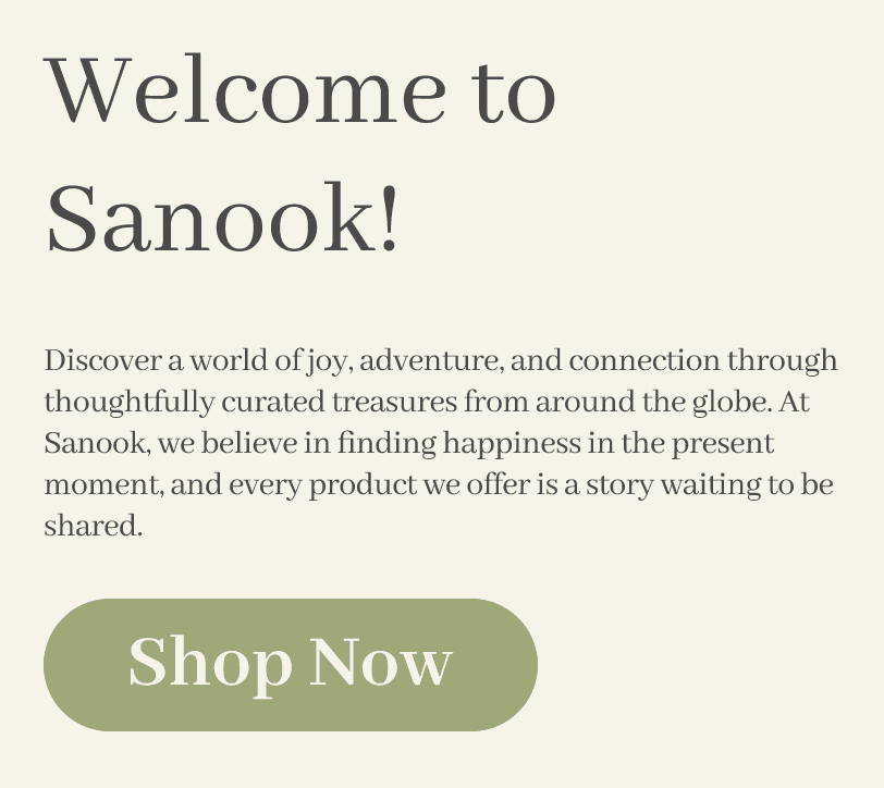
I simplified navigation, cleaned up the layout, and surfaced the brand story to turn confusion into clarity and engagement.
Ideation Highlights: Each round of testing led to focused changes that improved clarity, reduced friction, and strengthened the brand story.
Simplified homepage layout and removed competing CTAs
Renamed vague categories to improve navigation
Fixed cart flow issue that redirected users to the homepage
Reworked filter labels and positioning for better usability
Refined CTA copy and product descriptions to match brand tone
My Approach: Grounded in user research, I sketched and tested ideas to simplify the shopping experience. I focused on making key actions intuitive while reinforcing trust and brand clarity.
Key Concepts Explored:
Streamlined site architecture to reduce friction
Surfaced brand storytelling earlier in the journey
Clarified content hierarchy to support decision-making
Renamed categories for faster orientation
Key Constraints & Pivots
Timeline: 7 weeks to improve clarity, trust, and usability within a fixed sprint
Visual Limits: Required to keep original logo
Navigation Fix: Removed “Shop by Collection” after testing showed confusion
Brand Story Priority: Elevated founder story & mission earlier in flow to build trust
Tone & Clarity: Renamed categories and adjusted copy to reduce decision friction

See how I used layout, hierarchy, and tone to transform a confusing site into a clear, trustworthy experience.

Testing & Validation
From Ideas to Tested Solutions
Method
Moderated usability testing on Figma prototype
Participants
5 online shoppers (ages 26–64), all unfamiliar with Sanook
Tasks Tested
Find a gift within a budget
Explore homepage and navigation
View product details and assess clarity
Begin checkout
Locate shipping and return policy info
Key Outcomes
100% completed core tasks in 2–3 clicks (previously 7+)
CTA engagement time dropped from 18s → 5s
Product clicks reduced from 3.5 → 1.8
Users reported greater clarity and stronger trust in the experience
Top Fixes Based on Feedback
Clickability issues: Updated button styling and hierarchy for clearer interaction cues
Missing feedback: Added a “Go to Cart” button after item add
Product info gaps: Rewrote titles and descriptions to improve context
Logo expectation: Made logo clickable to return to homepage
Shipping clarity: Improved visibility of policy links and wording

Final Design
Final Product Summary: A streamlined experience that highlights Sanook’s mission, builds trust, and helps users explore and shop with confidence.
Key Features & User Impact
Faster product discovery
Clear navigation and simplified categories reduce friction
Increased trust and clarity
Visible policies and founder story build confidence
Better content readability
Adjusted layout and tone create a calmer, easier experience
Business Value
Stronger first impressions through brand storytelling
Faster product discovery encourages browsing and increases add-to-cart behavior
Improved clarity reduces drop-offs and supports return visits
Streamlined structure sets a foundation for future scalability without backend changes
Metrics
Navigation clicks reduced from 7 → 2
CTA engagement time dropped from 18s → 5s
Product clicks reduced from 3.5 → 1.8
All users completed primary tasks successfully
Reflection & Next Steps
"Kudos on collaboration and giving credit to team members."
— Advisor
What I'm Proud Of
I redesigned a confusing boutique site into a calm, user-friendly experience that reflected the brand’s values, all while working within tight visual and platform constraints.
What I'd Improve Next Time
I’d run A/B tests on layout and CTA placement, gather feedback from a live version, and continue expanding accessibility features
Key Learning
Small changes, like clearer labels or a simplified structure, can make a big difference in clarity, trust, and user confidence.
How This Shaped Me as a Designer
It strengthened my ability to design with empathy, respond to feedback, and make thoughtful trade-offs that prioritize clarity and usability.
This project reinforced my focus on designing clear, trustworthy tools that help people feel supported as they navigate complex tasks or decisions.

Fresh Futures
Curious How I work on a team?
Tackling Food InsEcrity
Design ing a Mobile-first platform that helps communities grow food & resilience

